Mini Project- Value Charts
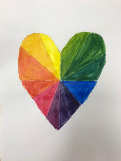
This was a mini project that helped with mixing colors. We had to paint the three primary colors first. We then had to do the secondary and all the colors in between.
|
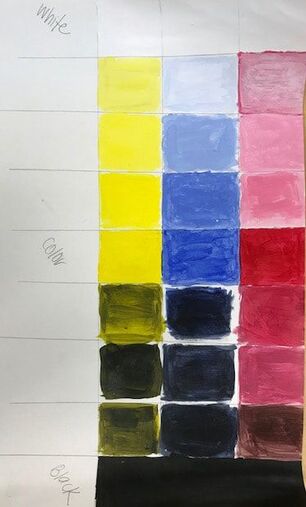
This was another mini project where we had to paint. In this project we had to combine colors. We had to make tints on the left and work our way to making shades. This was to practice doing transition colors from the lightest to the darkest.
|
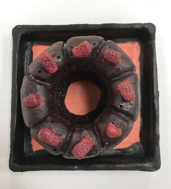
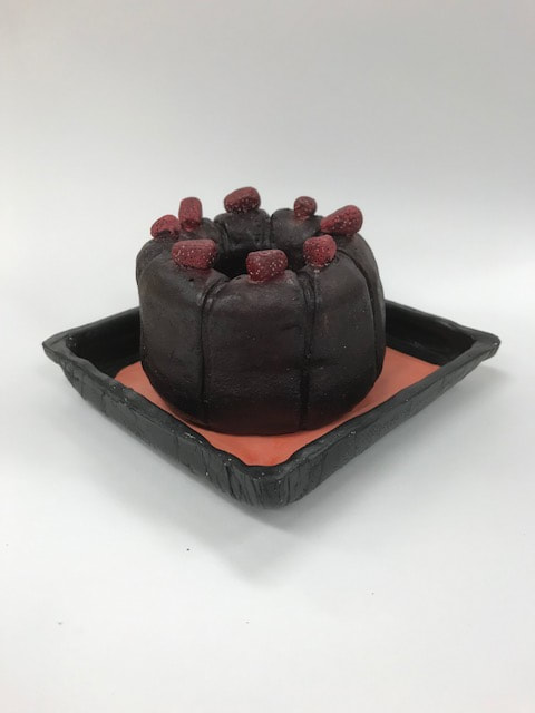
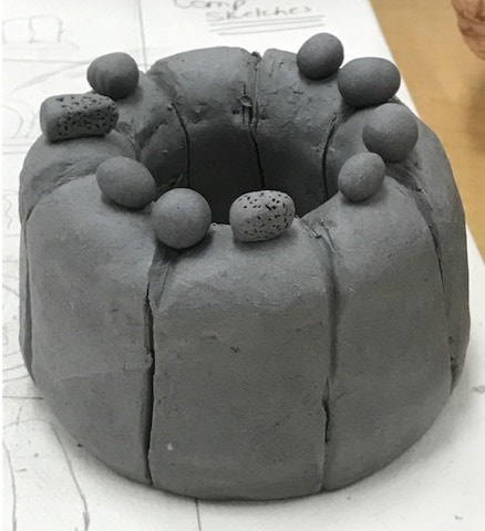
Major Project- Final Clay Food

- Describe the craftsmanship of your sculpture. (Is it neat and well executed?)
- The craftsmanship turned out to be pretty good. Before the kiln, I think the shape turned out bundt-like. The fruits on the top look like how a dessert would be served.
- What was the most difficult part of this project?
- Overall, the hardest part was doing the curves to show each piece of the cake. There is a fine line between digging in too deep and not deep enough. Then sometimes the curves would look too straight.
- Did your color choices work together harmoniously?
- The colors made the cake look real. I think that the berries on the top add a nice pop of color. The plate also adds a nice pop of color. All the colors connect and look good together.
- Is your sculpture interesting from all views?
- I think so. The best is seeing it from at a angle where all the strawberries are shown. Most of the angles are all similar because the bundt cake is the same all around. After the kiln, when put on the plate it looks realistic.
- Describe the differences in constructing a sculpture and doing something 2D.
- When doing a sculpture you get to see it from all angles. It should be done with limited mess ups because the viewer will be able to see it all around. When doing 2D it can look flat and on purpose.
- How did you create textures in your sculpture?
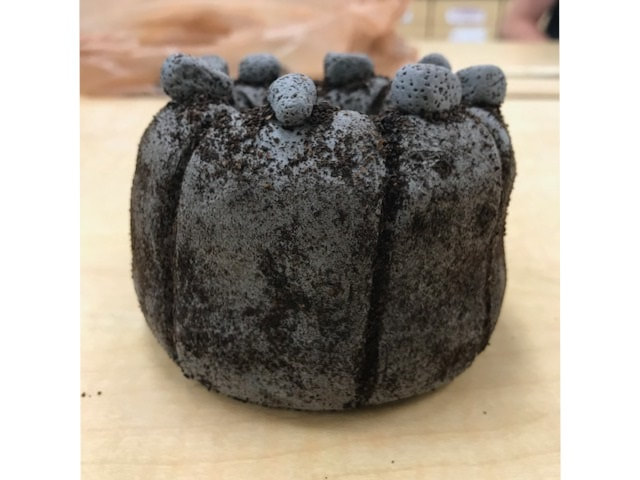
- I added the coffee grounds on the sides to make the cake have texture. For the strawberries there are little holes to represent the seeds. After the kiln, I did a technique that filled the white spots from the coffee grounds. Instead of having the white spots the water would take the color and put it in the spots to show texture.
- Does your sculpture look like the actual food? How did you accomplish this?
- I like to think it does. I tried to make the curves as round as a real cake looks. I made the texture look realistic. After the kiln, I painted with a brown that looks like a chocolate bundt cake. The places where the coffee grounds stayed on (and were indented into) made the sides have the cake texture.
- What would you do differently if you were to do this project again?
- I would have found a new way to attach the pieces for the cake itself. The way I did it made it very dense. After the kiln, I think I should have added more coffee grounds to add the cake texture on the outside of the cake. Most of the grounds stayed on the inside so the inside is textured more.
In Progress- Clay food (Pre Firing)This was the cake from a side view. This is with the coffee grounds to show texture. The toppings are scored and slipped on top. This was before it was put in the kiln.
|
|
In Progress- Clay food
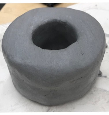
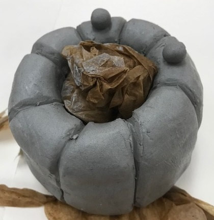

I started off building saucers of clay that i scorned and slipped together. I smoothed out the sides to make it look cohesive. Once everything was smoothed, I created divots to represent the humps to show each piece of the cake. I also wanted to add toppings. I started with multiple things on top but I later decided on just one topping.
Brainstorming Clay (In Progress)

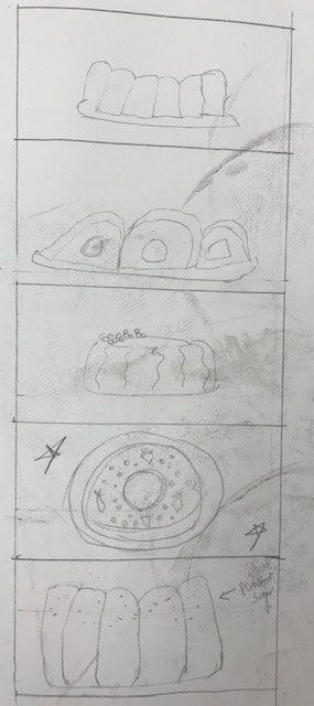
This was my third idea. The first two were already taken and I didn't want to copy. I have my reference images and composition sketches.
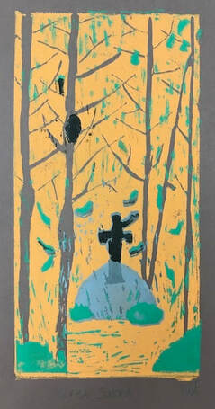
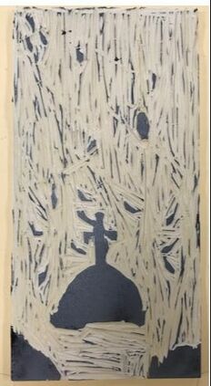
Major Project- Final Printmaking
- Describe the craftsmanship of your prints. (How good the project is technically crafted)
- registration and carving
- burnishing and ink coverage
- How did you use texture, color harmony and balance to define your choice of subject?
- texture
- color harmony
- balance
- If you could recreate your pieces what would you do differently to enhance your final outcome?
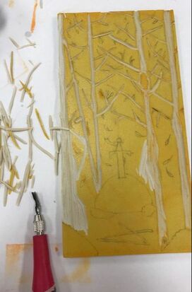
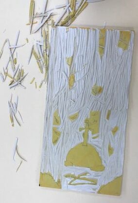
Printmaking in-progress
|
|
|
These are the first three sessions of cutting. I have done two colors for the color. Three more to go.
Printmaking Final Sketch
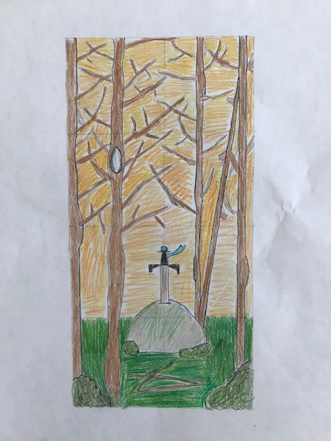


The hard copy of my sketch with color all the way to just about to begin cutting.
Printmaking 20 Ideas and Reference Images and Composition Sketches
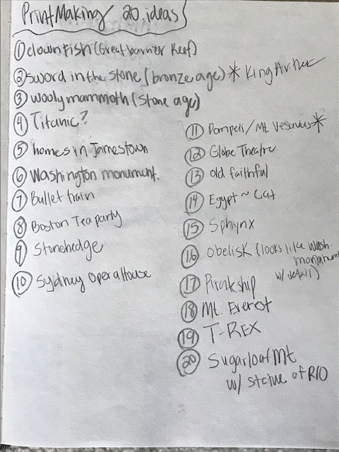
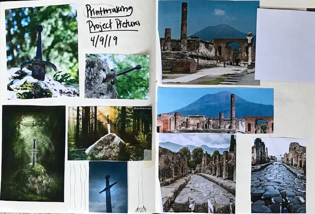
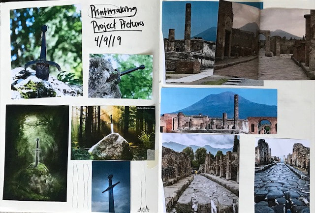
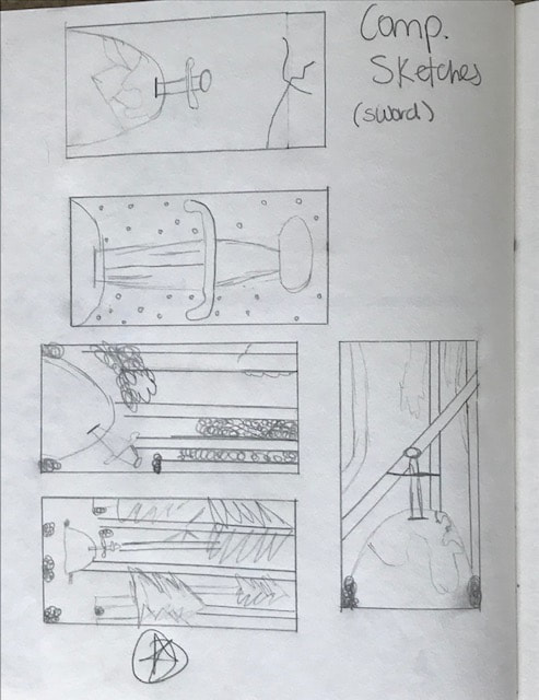
The two I ended up going with are the sword in the stone and Pompeii. My final idea was Excalibur.
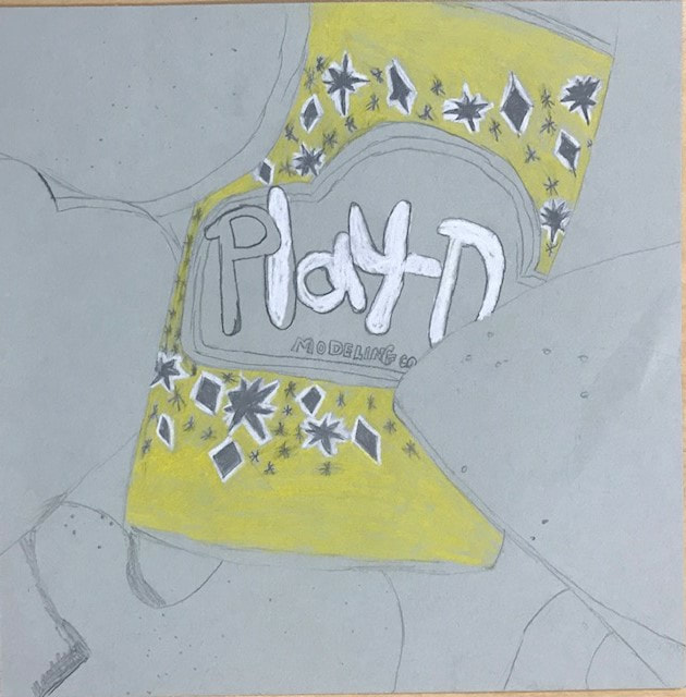
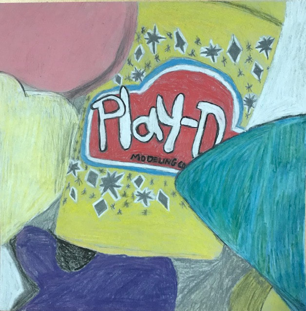
Major Project: Play-Doh FINAL (4/4/19)
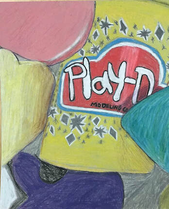
- Describe the overall composition of your artwork (balance, unity, rhythm and movement).
- The yellow Play-Doh container was the focal point and center of the composition. The Play-Doh shapes help pull the piece together and flow nicely. I maybe should have added one more shape to make the piece a little more balanced. I had a little more empty space than I wanted.
- How did you use value to create dimension? Is this important? Why?
- I used value to show that there were things behind and in front of the container. The darker parts are meant to show the 3-Dness and the perspective of the objects. The darkness is to also show there are places where the light can't lighten up since there are things in-front or behind it. Value is important because it makes the piece look really 3D.
- What did you achieve by using exaggerated color?
- The colors of the Play-Doh are very bright in general. I used exceptional bright prisma color to draw attention to the piece. I love how close up the whole picture truly is. It makes the piece really stand out and not look flat.
- Describe the craftsmanship of your colored pencil/chalk pastel. (How good the project is technically crafted)
- I feel like I did some parts better than others. The yellow container came out the best out of the entire composition. I think that the way the colors blend together make the container pop. I do feel that with more practice I could have made the colors blend better in the yellow heart. Also, I could have done better with the pink circle piece. It doesn't look as sharp as I wanted.
- Were you able to achieve depth by showing a foreground, middle ground and back- ground? Explain.
- I am not sure that I was able to achieve the depth I wanted. I created some depth but I wasn't able to create much because of the placement of the purple butterfly. Everything was pretty much in the middle ground since there wasn't much of a background or foreground to draw. I would have needed smaller things in the background or further up in the foreground.
- Explain your experience with colored pencil/chalk pastel. What were the obstacles and advantages?
- The colored pencils made my piece a good experience. It was easy to get bright colors with the prisma pencils. The blending of the browns was hard but it made it a learning experience. I should have decided to do more parts to the display to make more of a foreground, middle ground and back-ground. However, I think it wasn't too bad for my first time.
Major Project: Work in progress- Play-Doh Chalk Pencils
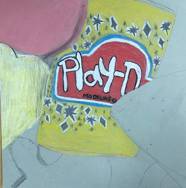

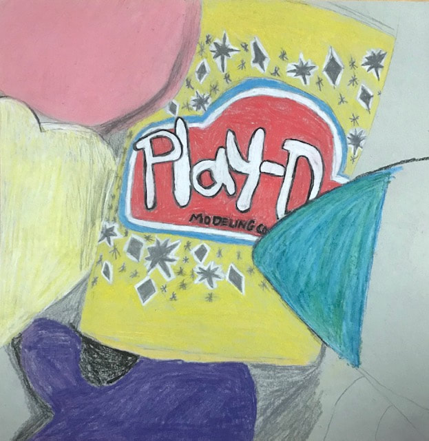
These are the in progress pictures for the chalk pencils.
Major Project: Brainstormed Ideas & Composition Ideas
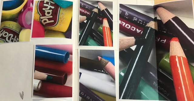
I ended up choosing the Play-Doh and pencils as my two final ideas. I thought they both were easy to obtain and gives lots of options for colors. I decided to do the Play- Doh as my final idea since it is a different idea.
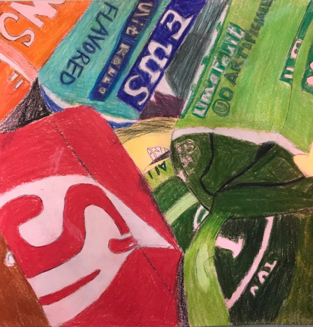
Mini Project- Prisma Candy (3/23/19)We had to dump out the candy in a jar to draw in prisma colors. We had to find a position we liked that had lots of colors. Once we found the position we liked, we had to take a very up close picture.
|
|
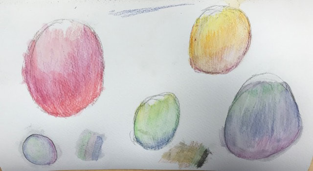
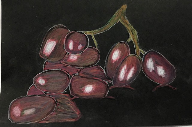
Mini Project- Final Watercolor (3/19/19)
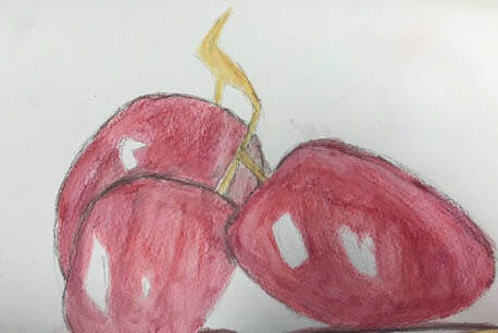
I took the same fruit from the other projects but only focused on just a few grapes. This one was made out of watercolor pencils. I think I got the closest to the picture out of the three. The shapes and the colors were the best here.
Mini Project- Watercolor with Watercolor PencilsThis was my first experience with the watercolor pencils. We did some practice with the colors and how the blending worked. We first laid down a layer of watercolor pencil. When the pencil was laid down, you took a paintbrush and blended the colors with water.
|
|
Mini Project- Final (3/18/19)
|
This was my final piece drawn in chalk pencils. I tried to use extra colors to add texture. I need to work on incorporating the white with the rest of the colors in the picture. I think adding the black around the edges added depth. The stem turned out well.
|
|
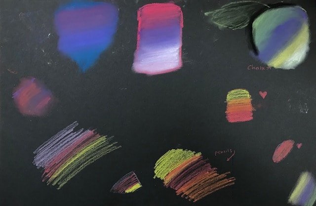
Mini Project- Prisma Chalk and Pencil (3/14/19)
|
This was my practice with blending with regular chalk and the chalk pencils. The top was the prisma chalk blending practice. The bottom was the pencil prisma blending. The purpose was to show the difference between the two and how each blended on black paper.
|
|
Mini Project- Final (3/14/19)
This was my first project using "Prisma" colored pencils. I think I did well with blending of the colors. I think I need to work on adding and blending the white parts that show highlight.
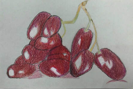
Mini Project- Prisma shapes (3/12/19)
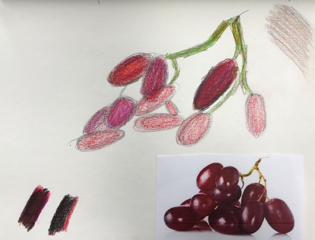
We did some practice with "Prisma" colored pencils. We tested out two shapes on three colors of paper to see how the colored pencils would show up on each paper. On the paper, we practiced blending and how it looked on the shapes. Finally, we had to pick a fruit or veggie and we had to draw it on one of the papers. I chose to draw a group of grapes. The picture is my practice drawing.
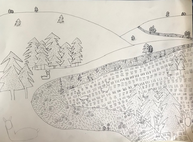
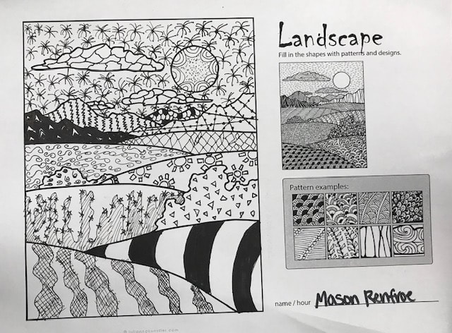
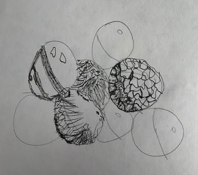
Final Project- Pen and Ink!
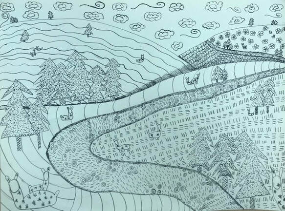
- Describe how you arranged your composition. Discuss your use of the elements and principles. Is it a successful composition?
- I decided to do a landscape with perspective. I tried to use trees to distinguish perspective and distance. I think this was a successful composition because each detail flows. Your eye just follows the river, up the sides of the mountains, and into the sky. I used the llamas to also distinguish size comparison with the smaller llamas seeming very far away.
- How is texture and pattern important in your composition?
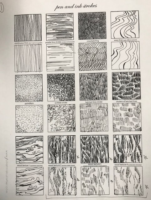
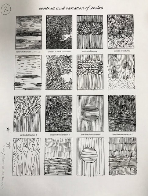
- Texture is important so the viewer could tell which part of the composition was the grass and which parts were the mountains. The pattern was also important to make the picture flow. Specifically, pattern was important in the river as to show movement. I used many different types of textures to create different sections of the piece. The grass texture looks like grass while the river has bubble types and lines. I used unique textures to make the mountains appear different too. The llamas have a star texture to give a feeling of their coats. Finally, the trees were stippled and the the trunks were cross hatched to show wood texture.
- Why is value so important in this project?
- It shows perspective and depth. It also helps with showing distance or where an object lays in the composition. The value in the river shows that it is flowing over the land. The mountains also have darker parts to show the perspective of one being in front of another mountain. I think the stippling in the trees also creates a darker contrast to the rest of the composition.
- Describe your craftsmanship (How well the project is crafted technically).
- I think the patterns all work well together. The stippling was a good texture for the trees and the trunks worked well with cross hatching. I tried to balance the textures to give the composition a flow. My favorite part was the grass texture because it looked just like its counterpart and it was pretty easy for me to do. Some of the textures were more difficult for me than others.
- Explain how your knowledge and creating practice studies with value and pattern contributed to the success of your piece.
- It helped me better understand the power of a good pattern. It also helped me figure out which patterns would fit best. I created a lot of unique textures when I practiced the 100 boxes. I actually came up with ideas from my ideas.
- When applying the pen and ink/pattern techniques why and how is it important to make sure you understand the concepts taught in class?
- The better you understand the easier it is to produce a successful and balanced piece of art. Plus, you have to be very careful when you use the pens. If you push too hard, it goes really dark. If you didn't want this, it could mess your piece up.
- As a growing artist how do you think what you have learned will guide and better your future projects. Explain.
- I think that values and appropriate textures can benefit a person's art. I learned a lot from my ideas which stemmed other ideas. Being creative with the textures and trying new things never hurts. I will continue to do this to benefit my creative ability and to practice thinking outside of the box.
- If you could recreate your piece what would you do differently to enhance your final outcome?
- I would have added more detail to the trees so as to enhance the amount of contrast. I would have chosen a slightly different pattern for the sky. I also probably would have added a few more llamas on the big mountain. Maybe even have changed the big mountain's texture all together.
Final Project Pen- In progress

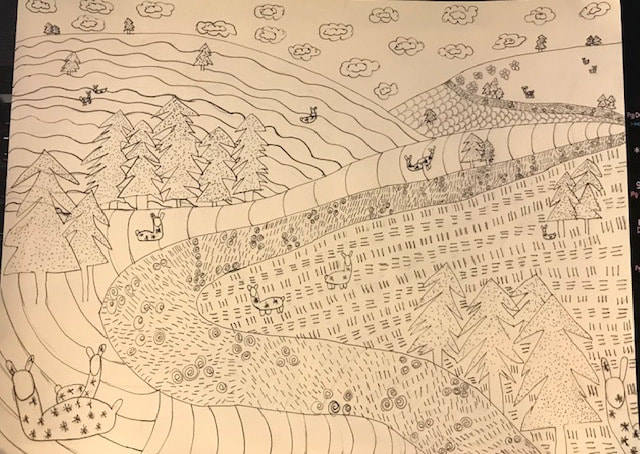
These are the in progress pictures of my landscape with pen.
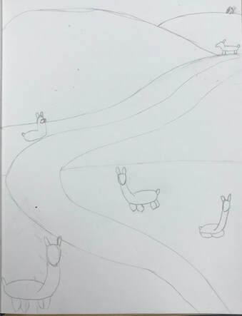
Final Project- Pencil Sketch
|
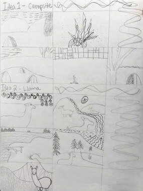
This is my pen sketch for my final project! These two were in pencil as to just get an idea for which textures will go where. I wanted to switch the textures on the back mountains for the first one.
|
|

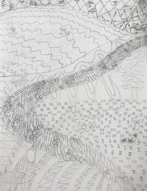
Final Pen Project- In progress
I started off with a quick layout and the placement of the llamas. I also drew out the layout for the background.
Final Project- Composition Sketches (2/28/19)I took two ideas from my list and drew them to lay out how my final could possibly look. I drew possible textures in come of the drawings to also see my options. I think the llamas will give me more opportunity to have lots of different textures.
|
|
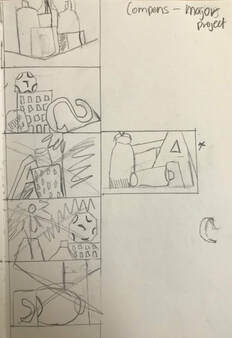
Major Project: Brainstormed ideas
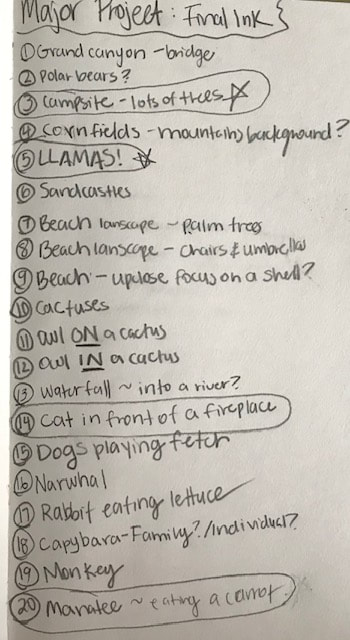
20 brainstormed ideas for the final project for pen!
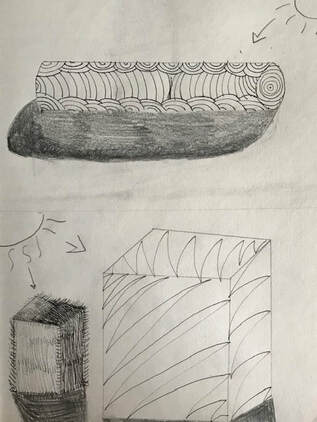
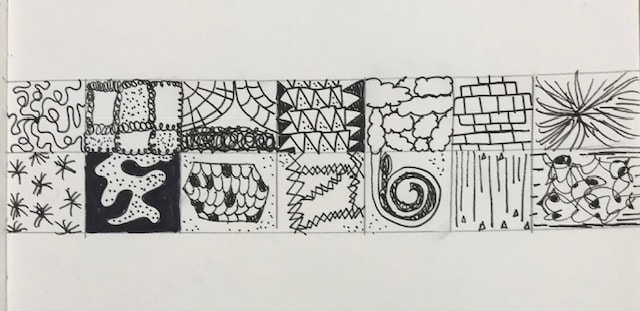
Mini Project- Extra Texture Practice
|
This was another project to practice pen. We had to draw the two shapes and make the pattern look like it goes around the entire shape. We also had to think about how the pattern would look with a light source. Lighter parts of the pattern where the light source directly hits the form. I think I did the second cube pattern the best.
|
|
Mini Project- Pen Texture Landscape
|
We could take our 100 textures or other examples and had to place them in the landscape to make a nice composition. We had to practice contrast and variation with the different textures. I think that I need to practice contour. If I could have re-done this I would have done a lighter texture for the sky.
|
|
Mini Project- 100 textures
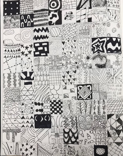
This was a project where we practiced with pen again. We had to come up with 100 textures that repeated (no pictures). We would use these for ideas for our final project. They ranged from dark textures to stippling as the light textures.
Mini Project- Pen Textures Practice
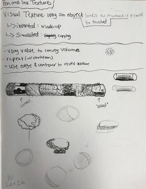
These were notes on how to practice textures. We had a couple of videos we had to follow. One video was of the cylinder with the different textures. The other was to show light sources and textures on spheres. I definitely need more practice with textures.
Mini Project- More Pen Practice
We did more pen control practice with this project. We had to look at the given picture on the top and re-draw it in the box underneath. For example we had some to practice with stippling, and hatching.
Mini Project- Pen Practice
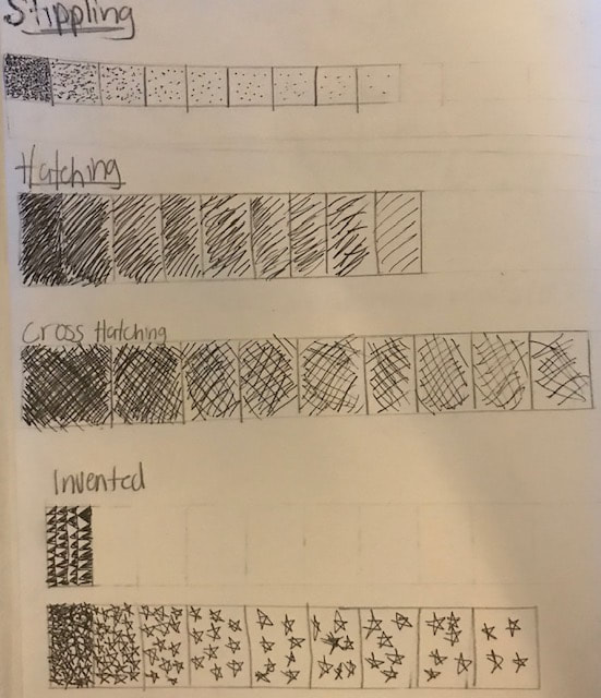

We practiced the value chart in the beginning. Then we learned about the four techniques for pen. We then did four shapes for each of the techniques. Each shape had its own technique: sphere with stippling, cone with hatching, cylinder with cross hatching, and cube with random. Shading was also included in this project with light sources and cast shadows. I think I did the cone the best. Its technique was easier. I think the worst on the cylinder because the awkward middle cross hatch didn't turn out as well as I wanted it to.
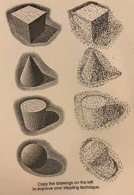
Mini Project- Stippling Practice
|
In this project we practiced stippling. We had to copy the shading of the shape on the left and recreate it with our pen control on the right. I think I did well on the cube because you can actually tell there are different sides of the shading. I think I did the sphere the worst because I messed up the cast shadow for one thing. I definitely need more practice. Stippling is certainly hard!
|
|
Final Artwork- Still Life
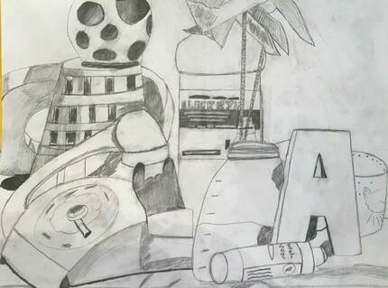
- Describe how you arranged your composition. Discuss your use of the elements and principles. Is it a successful composition?
- My composition was an arrangement of random objects put out. I picked the section that was most interesting to me. I used shading for the shadows inside of the slanted letters. I also used shadow to show a couple of objects were put off to the side at an angle. I am pretty proud of the way the phone turned out and the paint bottle in the background.
- Did you use a wide range of values? (A range from white to black with at least 9 values). Explain how is this evident?
- I tried to use as much range as I could. I used the most value in the shadows like the part of the phone and the basket holes. I left some of the objects lighter to show change in the value of the still life. I am not sure if I actually used 9 values but I ranged from light to dark as best as I could.
- Explain how your knowledge and creating practice studies with value contributed to your piece.
- The practice pieces gave me an idea on how much I need to control my pencil. The more you push on the lead the darker it gets which makes a piece look flat. The practice with shading helped me realize where appropriate shading was needed.
- Describe the blending and transitions in your objects (discuss your use of pressure with pencil and other techniques to achieve this).
- On the ball shape I used lots of pressure to make the dents look 3D. I also used a lot of pressure on the shadows of the letters and on the phone holder to show depth. I tried to use blending on the S, on the base of the phone and on the basket.
- Explain how your interpretation of texture is essential in capturing the look of the object.
- The more texture the more realistic a piece looks. If there is a shadow from another piece, it shows something is in-front of something else. By adding textures with shading I attempted to make it look real and 3D.
- If you could recreate your pieces what would you do differently to enhance the final outcome?
- I think I would have made my perspective smaller to focus on more details on fewer specific things. I would have cropped out anything above the cap of the red paint. I focused on too many objects. I should have spent more time on the part below the pinwheels.
Still Life In Progress
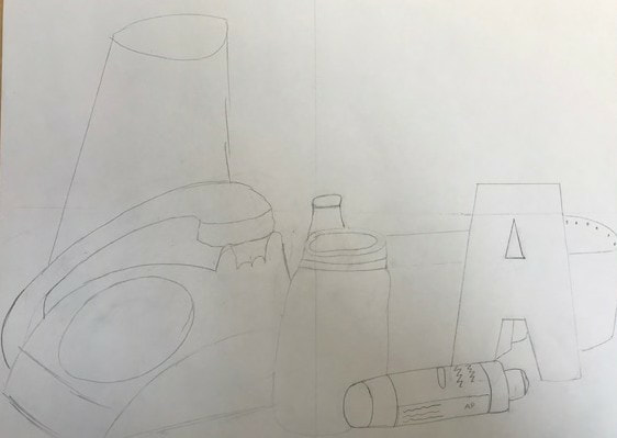

These are the in progress pictures for my still life. The first image was the first sketch. The second image had more parts and has a little more shading. The third has more shading and detail.
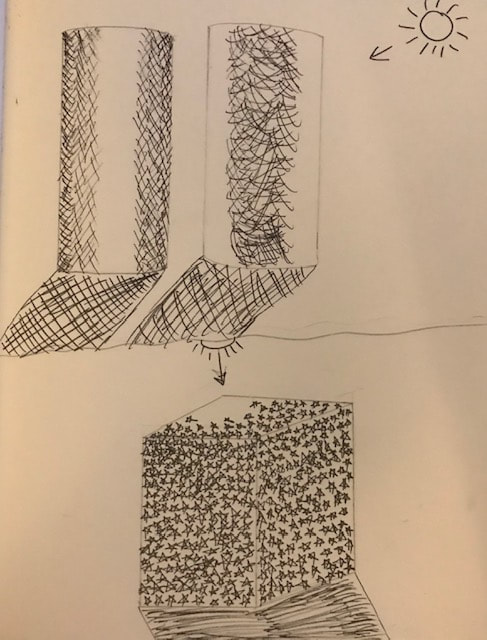
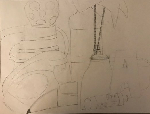
Angles with perspective for still life (Final Project) 1/29/19
|
These are composition sketches using perspective for this still life final project. We had to cut out a rectangle in the middle of a square piece of paper and look through it to see what you can draw in that space. If the objects went past the sides of the rectangle they weren't seen so you didn't draw them. We could have done sketches from all sides to find the best one.
|
|
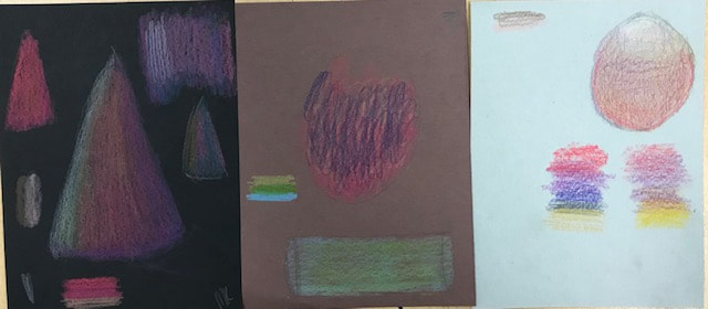
Mini Project- Pencil and Prismacolor Shading 1/29/19
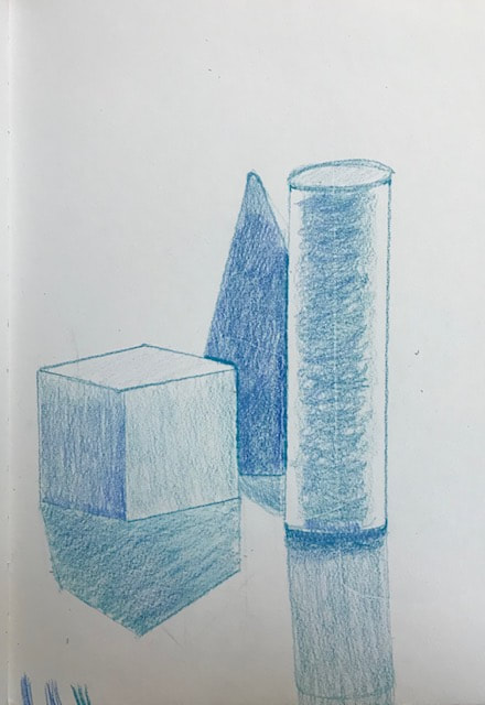
We did more shading practice but with 3-D shapes. There were three shapes on the table that were taped to the yellow paper to show shadows. The lights were shining down on the shapes and we had to draw what we saw. Once we had the basic shapes drawn we had to add value and shadows to the drawings. One we did in regular pencil and the other we did Prismacolor. If there was a shape blocking another we had to make the shading look like it was blocking.
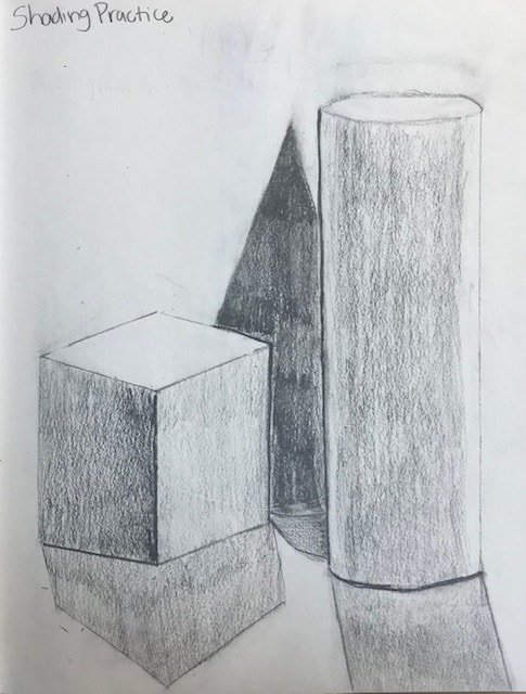
Mini Project- Shading 1/26/19
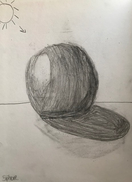
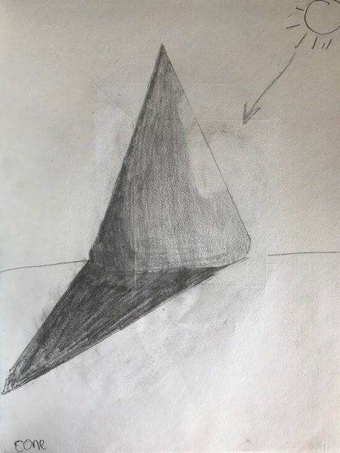

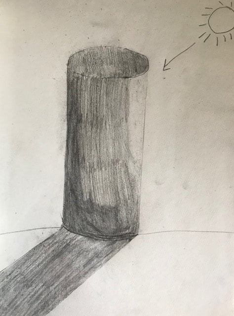
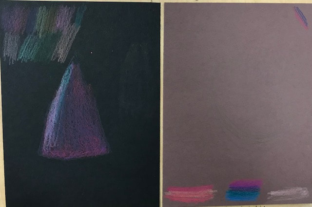
This project was meant to practice shading. We had to draw four shapes-a sphere, cone, cube, and a cylinder. We had to distinguish a light source to show reflection. We then had to show our shading skill with the lightest being where the light would hit the shape. It has been a long time since I have shaded so I definitely need more practice. The sphere was the one I did the worst by far. I think the cube came out the best.
Mini Project- 1st Project 1/23/19

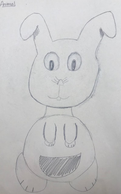
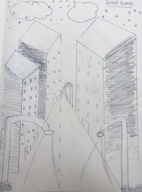

In this project we had to draw four different pictures to show shading and perspective. This was a test so see where our skill level was. Personally, I feel like I did the landscape the best out of the four drawings. I was a little off with the perspective for the city street picture. I definitely need more practice on drawing animals and circles. I think the shading was good and enhanced the pictures but I still need more practice.
